Modern Portal UI Template
Project Overview
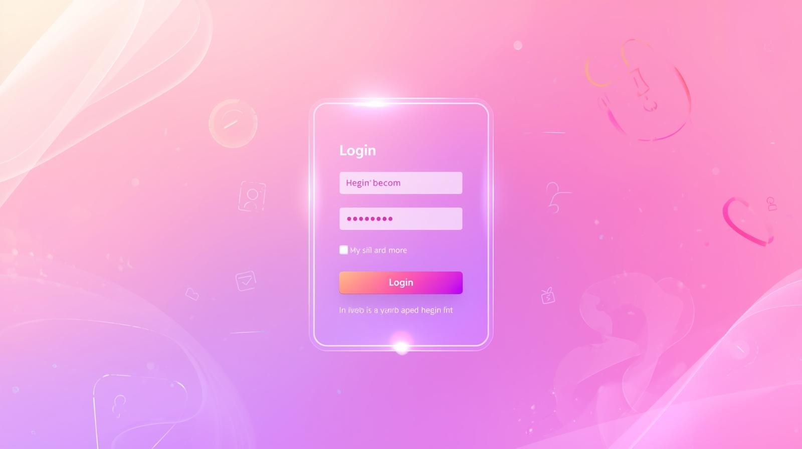
A beautifully designed modern portal interface with smooth glassmorphism effects and excellent user experience. This template demonstrates best practices in clean UI design, responsive layouts, and interactive elements using vanilla CSS.
Key Features:
- Smooth input animations
- Icon integration (Boxicons)
- Floating labels
- Remember me checkbox
- Forgot password link
- Responsive design
📄 index.html - Login Form Structure
How HTML Works:
The HTML creates a semantic login form with input fields for username and password. Each input has an associated label for better accessibility. Icons are added using Boxicons library for a modern look.
<div class="wrapper">
    <div class="login_box">
        <div class="login-header">
            <span>Portal Access</span>
        </div>

        <div class="input_box">
            <input type="text" id="user" class="input-field" required>
            <label for="user" class="label">System ID</label>
            <i class="bx bx-user icon"></i>
        </div>

        <div class="input_box">
            <input type="password" id="pass" class="input-field" required>
            <label for="pass" class="label">Access Key</label>
            <i class="bx bx-lock-alt icon"></i>
        </div>

        <div class="remember-forgot">
            <input type="checkbox" id="remember">
            <label for="remember">Remember me</label>
            <a href="#">Forgot password?</a>
        </div>

        <input type="submit" class="input-submit" value="Connect">

        <div class="register">
            <span>Don't have an account? <a href="#">Register</a></span>
        </div>
    </div>
</div>
🎨 style.css - Modern Form Styling
How CSS Works:
CSS creates a centered, glassmorphic login box with smooth animations. Input fields have floating labels that move up on focus. Icons are positioned inside inputs. The design uses gradients and shadows for depth.
.wrapper {
    display: flex;
    justify-content: center;
    align-items: center;
    min-height: 100vh;
    background: linear-gradient(135deg, #667eea 0%, #764ba2 100%);
}

.login_box {
    position: relative;
    width: 400px;
    background: rgba(255, 255, 255, 0.1);
    border: 2px solid rgba(255, 255, 255, 0.2);
    backdrop-filter: blur(10px);
    border-radius: 10px;
    padding: 30px;
}

.login-header {
    text-align: center;
    color: white;
    font-size: 1.5rem;
    margin-bottom: 30px;
    font-weight: 600;
}

.input_box {
    position: relative;
    margin-bottom: 20px;
}

.input-field {
    width: 100%;
    height: 40px;
    background: rgba(255, 255, 255, 0.2);
    border: none;
    border-bottom: 2px solid rgba(255, 255, 255, 0.5);
    color: white;
    padding: 10px 40px 10px 10px;
    transition: 0.3s;
}

.input-field:focus {
    background: rgba(255, 255, 255, 0.3);
    border-bottom-color: #667eea;
    outline: none;
}

.label {
    position: absolute;
    top: 50%;
    left: 10px;
    transform: translateY(-50%);
    color: rgba(255, 255, 255, 0.7);
    pointer-events: none;
    transition: 0.3s;
}

.input-field:focus ~ .label,
.input-field:valid ~ .label {
    top: -10px;
    color: white;
    font-size: 0.9rem;
}

.icon {
    position: absolute;
    right: 10px;
    top: 50%;
    transform: translateY(-50%);
    color: white;
}

.input-submit {
    width: 100%;
    height: 40px;
    background: #667eea;
    border: none;
    border-radius: 5px;
    color: white;
    font-weight: 600;
    cursor: pointer;
    transition: 0.3s;
    margin-top: 20px;
}

.input-submit:hover {
    background: #5568d3;
}
How Everything Works Together
1. HTML Structure: Creates form with input fields and labels. Each input is associated with a label for accessibility. Icons enhance visual appeal.
2. CSS Styling: Positions labels absolutely so they float over inputs. Uses backdrop-filter for glassmorphism effect. Transitions smooth all interactions.
3. User Interaction: User clicks input → label floats up → icon displays → input receives focus. CSS :focus and :valid selectors control these animations.
4. Accessibility: Proper label-input associations, required fields, and semantic HTML ensure the form is accessible to all users.